
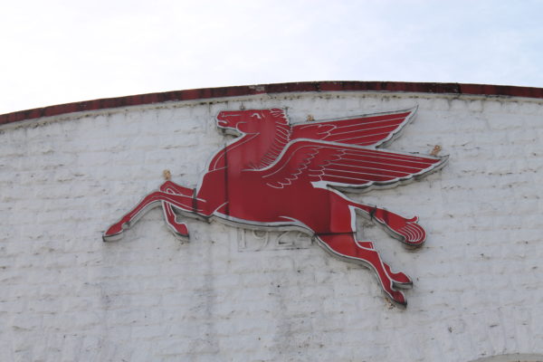
The red Pegasus has been the logo of Mobil, and before that Mobilgas and SOCONY, going back to 1931. The company itself is even older, tracing its origins to the Vacuum Oil Company of Rochester, NY, founded in 1866. Like so many oil companies of the early petroleum era, Vacuum Oil found its way into the Standard Oil empire of John D. Rockefeller. After the Standard Oil Trust was broken up in 1911, Vacuum Oil became independent again and the New York regional interests of Standard Oil became SOCONY – the Standard Oil Company of New York.
Then, in 1931, SOCONY and Vacuum Oil merged back together, after the government gave up trying to prevent it. The Socony Vacuum Oil Company adopted the red Pegasus as its trademark that year. The image of a flying horse was a powerful one in an era when horses were still remembered as a primary form of transportation, and gasoline engines were so powerful by comparison it almost seemed as though a horse could fly.
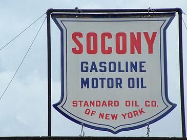
The name SOCONY would prove problematic for a company distributing its products nationally, however. As part of the 1911 Standard Oil breakup, use of the name Standard Oil – or any variation thereof – could be challenged by other Standard Oils in their home territory. This is precisely why Midwest Standard stations (Standard Oil of Indiana) were known as Amoco in the East, and why Esso – phonetically S. O. for Standard Oil – would eventually rename itself Exxon.
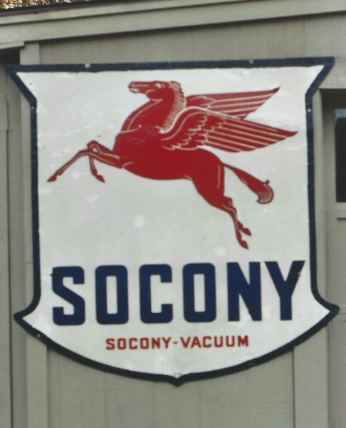
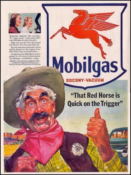
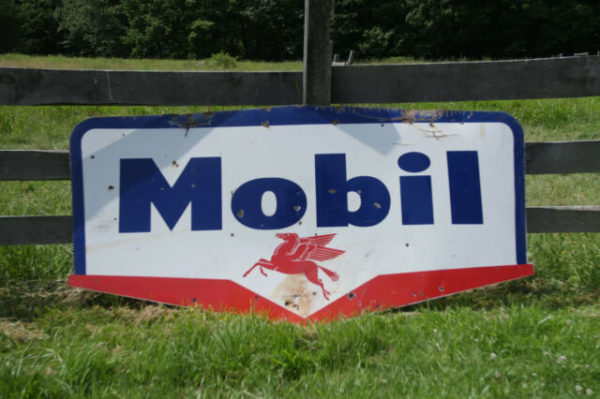
For Socony Vacuum (which also included regional companies Magnolia Petroleum in Texas and General Petroleum in California), the answer came in their brand names, Mobilgas and Mobiloil. Mobilgas – still paired with the red Pegasus – became the dominant name on the sign, with a smaller “Socony – Vacuum” underneath.
The corporate name and image would continue to evolve, becoming Socony Mobil Oil Company in 1956, with a new station sign that would have an especially short lifespan – only 10 years.
Then, in 1966, Mobil Oil Company celebrated its centennial, dated from the founding of Vacuum Oil in 1866, even though neither Socony nor Vacuum were part of the newly streamlined company name. It was time for a brand refresh:
Chermayeff & Geismar.
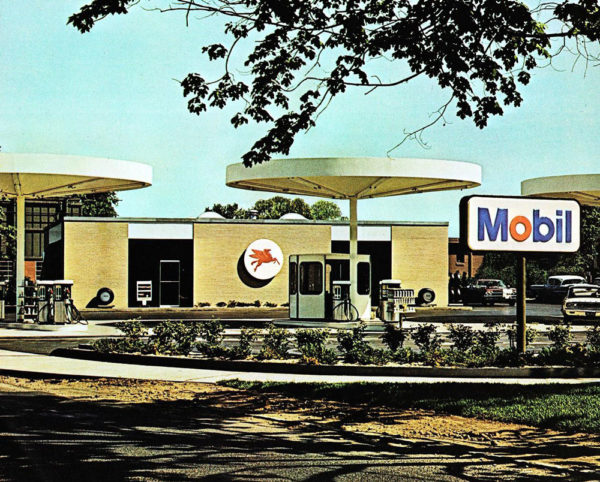
Architect and industrial designer Eliot Noyes led a near total redesign of Mobil station imagery. The new gasoline pumps were sleek cylindrical affairs with circular lighted canopies overhead. The new station sign featured a red o in Mobil, a now familiar trademark for 50-plus years.
One trademark was carried over nearly intact – the red Pegasus. However, after 35 years of leaping to the left, the image was mirrored so it is now leaping to the right.
Why was this done? I heard one report that the Pegasus was now leaping into the future.